Now a reality, Aldergrove Credit Union’s Mission branch design concepts are meeting organizational objectives.
Earlier this year Aldergrove Credit Union’s opened its newest branch in Mission BC. Our design approach was two-fold. We would integrate corporate operational goals and address aesthetics specific to the community into the branch design. Accommodation would be made for a move towards a paperless system and we would incorporate flexible workspaces to better meet current and future needs of staff, members and the community. With a long history of logging and wood processing in Mission, the use of wood features would provide a warm link to the community’s past.
Branch Design highlights:
Warm wood and friendly seated teller positions:
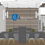

(click images to enlarge)
Credit Union Branch Design Decisions
With a priority on member experience, design decisions were made to facilitate community engagement; creating an innovative, accommodating and flexible space in which to meet the needs of members.
An innovative branch layout gives flexibility for staff and members now, and adaptability should layout changes be required in the future. Glazing to all branch exposures provides an opportunity to create inviting warm and welcoming vistas from the exterior, inviting questions and a peek inside.
Banquette seating in a unique millwork pod:
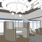
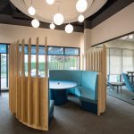
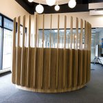
(click images to enlarge)
Open and closed meeting rooms including a community room for larger meetings or member bookings:
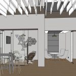
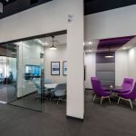
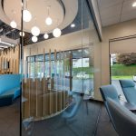
(click images to enlarge)
A casual high bar with coffee for touching base:
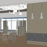
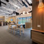
(click images to enlarge)
Client feedback:
At the close of RATIO’s furniture and materials presentation with the Aldergrove Credit Union team, they were really excited about the new branch design. The CEO closed by saying that we “had knocked this project out of the park.”
Have questions about this project or your own new build or tenant improvement project? Contact Chris Pollard.
See a selection of our work here.
Stay connected with RATIO: Sign up for RATIO news > Twitter > LinkedIn
